Death and Other Details
2024 | series
DoP G. Magni Ágústsson | Fernando Reyes Allendes | Jimmy Lindsey
Director Yangzom Brauen | David Petrarca | Dinh Thai | Marc Webb | James Griffiths | Alrick Riley
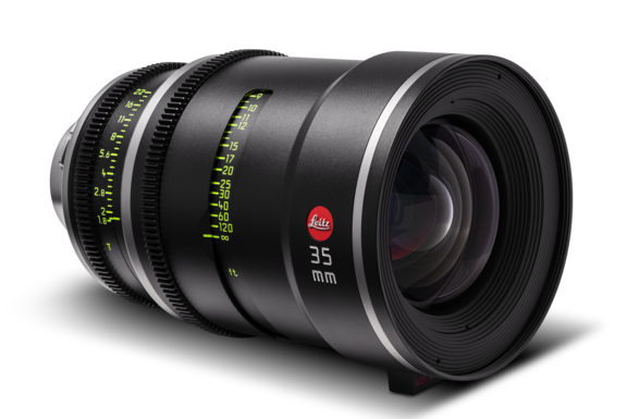
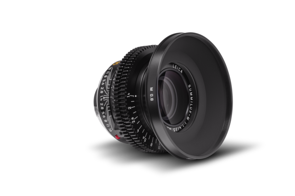
Leitz lens M 0.8, LEITZ PRIME
Production Companies ABC Signature | Black Lamb
Distribution Disney+ | Hulu
Awards 1 win & 1 nomination total
Equipment Supplier Keslow Camera | Los Angeles
Country USA
G. MAGNI ÁGÚSTSSON, IKS CAPTURES “DEATH AND OTHER DETAILS” ON LEITZ PRIMES
Death and Other Details is a Hulu Original series that follows aspiring investigator Imogene, played by Violett Beane, as she attempts to solve a murder mystery on a cruise ship surrounded by the world’s wealthy and elite. Together with Detective Rufus Cotesworth (Mandy Patinkin), the pair must navigate a post-fact world to uncover the killer over the course of the 10-episode series. The series premiered on January 16, 2024.
Seth Emmons: Before we start talking about your upcoming series Death and Other Details, I would like to start with philosophy, particularly your approach to creating and capturing images as a cinematographer, which I find fascinating.
G. Magni Ágústsson, IKS: There are two major influences on my approach to image making and both are from a long time ago. The first revolves around the first photograph I ever took. I grew up in Iceland in the 1970s and 80s before digital cameras. Film and developing were expensive so the few occasions when their film camera was brought out were Christmas, birthdays, and vacations. For an entire three-week vacation we might only take two rolls of film, just 72 pictures, so those pictures had to be specific and important. I remember being in Venice, Italy on holiday with my parents when I was about nine years old and sitting at an outside coffee place in St. Mark’s Square. My dad gave me the camera for the first time and said, “Can you take a picture of me and your mom?” That was the first picture I ever took.
When we got back to Iceland I was super into the camera and constantly played with it without any film in it. That autumn my dad gave me the camera and I started taking black and white photographs. I set up my own dark room, but it was still expensive, so I still had to be selective of the photographs I took. I spent a lot of time studying photography books and trying to understand the purpose of each photograph and figure out their story to make my photography more meaningful and tell more of a story. My love of photography eventually led me into filmmaking.
When I’m lining up a shot I’m always thinking in the back of my mind, even in the corner that’s full of cobwebs, how can I tell this story with a single shot? How can I enhance the story by using just a single shot to give the audience the full idea?
And what was the second influence?
Photographer Ansel Adams spoke extensively about previsualization as a requirement in his photography. Practically for me, it goes back to when we shot on film and had to commit to the look beforehand. I look at the story and the scene in front of me and imagine what I want to capture. Then, if I know my tools: lenses, camera, filters, color workflow; I can record the image exactly as I saw it in my mind. But, I need to have that knowledge before we move into production and do the actual filming to enable me to previsualize in the moment on set.
“The whole key lies very specifically in seeing it in the mind’s eye, which we call visualization. And the picture has to be there clearly and decisively. If you have enough craft and you’ve done your homework and your practice, you can then make the photograph you desire.” - Ansel Adams
In TV production you quite often come to the same set over and over again, but it’s so well mapped out that it doesn’t matter which part of the set you’re standing in, you can see it 360° in your mind. You foresee that the light will come through the window like this, and you’ll put the camera there, or you’ll use the 50mm for this and the 40mm for that. You just have it all in your mind and you’re just copying it.
But you have to have an open mind because there are so many things that affect your emotion and understanding of a scene and how you’re going to film it. The director and I might have blocked it to shoot from one corner, but I happen to be standing in the other corner while watching the actors blocking with the director and everything just falls into place. That’s just how the mind works. You see the actors in the space and see the shadows that the light creates, then it all falls into place. To make that happen you first have to have an idea of how the scene works for the visual storytelling.
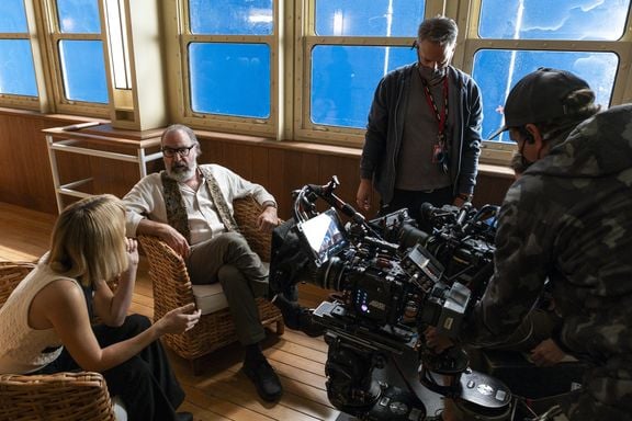
What is your approach to choosing lenses for a new project? How did you end up with the LEITZ PRIMEs on this specific series?
I’ve spent the last decade and a half trying every single lens that I could get my hands on for various commercials, TV shows, and features. I did this on purpose because I wanted to learn from them and I believe you learn the most about lenses in practical situations. It isn’t enough to just go into a test room at a camera house and shoot a chart and think you know the lenses. You have to put them in practical situations to really understand them. There are so many different lenses and they are fundamental to creating the character of the story you’re telling.
I have shot a couple of shows on the Leitz SUMMILUX-C lenses, including A Million Little Things and Stumptown. I quite like those lenses because I don’t really feel like I’m using lenses. They have this amazing personality all their own, but the character doesn’t overshine the visual storytelling for the story or the actors. It’s a very observant lens in a beautifully charismatic way.
When I came on Death and Other Details we knew from the pilot that it would be large format and spherical and from there I was able to make the camera and lens choices. I think the LEITZ PRIMEs were in the back of my mind because I love the Summiluxes and I wanted a lens in the same genre, but I wanted to do my due diligence. Keslow Camera in LA generously allowed me to test all the large format lenses they had and Teal Shore was incredibly kind and supportive during the process. I compared the Leitz THALIAs, the LEITZ PRIMEs, and numerous other brands. I even looked at Panavision lenses. But the LEITZ PRIMEs felt like the right tool for me for this particular story.
What characteristics of the LEITZ PRIMEs made them the right choice for this project?
What I like about the LEITZ PRIMEs lenses is that they’re very well designed. They have the details which I think are very, very nice in lenses. They have a short depth of field but have a crystal-clear image with no vignetting. This gives me the opportunity to manipulate them with filtration, both colored filters and diffusion filters, without compromising the quality of the optics and the image. I like using filters to age or manipulate the personality of lenses to my benefit. Every story has its own flavor and I create that flavor with filtration and lighting. The Leitz lenses, both Primes and Summiluxes, give me the freedom to use the tools to create the look of the image the way I want to. In this way they work very broadly for me personally for telling stories.
I also quite like to have a lot of lenses with all the in-between focal lengths. I want the whole scope of sizes with different fields of view so I’m not limited to certain lenses all the time and have the freedom of shooting according to the location or the set. With older lenses you only have 5 or 7 focal lengths to play with if you’re lucky and that is sometimes limiting. With modern lenses you have 12, 15, or more lens sizes to choose from. It’s helpful that there is very little character difference between each Leitz Prime focal length. I always admire writers because they can find a few words to describe something beautifully, while unfortunately I need lenses, cameras, crew, and a budget to say what I really want to say.
In short, I’ve come to a point in my life where I like to minimize my worries with all the elements on set and the tools that I have. The Leitz lenses give me that guarantee of being very conformed as a group of lenses and if I need to change a lens I’m not jumping far away from the way I see the story in my mind. I feel that the Leitz cine lenses very much replicate the look of the Leica still lenses, which have their unique sharpness and mix of soft and harsh contrast. The concept of contrast is so connected with light that I feel you can use the same lenses and they react with a sharp contrast, but also sometimes have in the out of focus elements a gentle softness of contrast to them. Another thing that’s quite nice about them is that even if you go on a 40 mm or a 65 mm or 100 mm that they all work as portrait lenses because they have that sharp focus which plays very nicely with the skin tones.
What I think is that the LEITZ PRIMEs kind of milk the contrast out a little bit, similar to the Noctilux. I’ve found with other lenses that sometimes when you shoot them wide open at close focus, you get this edge which is very noticeable around the edges of people’s faces that’s almost like a double image or very blurry edge. With the Leitz it rounds off very nicely and beautifully so you won’t see the borders of the out of focus element. It would just kind of fade out softly rather than have a hard stop. I think that’s very unique to the Leitz SUMMILUX-C lenses. It creates a nice, even texture rather than a harsh boundary.
Did you use any other lenses in combination with the LEITZ PRIMEs?
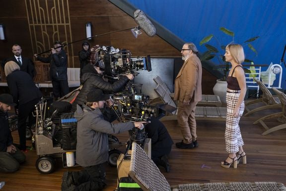
I enhanced the set with the Leitz M 0.8 50 mm Noctilux lens and used it as my main portrait lens for the main actresses to get her frame of mind or her position in the story. I would shoot that around wide open, which is aperture f/0.95. It’s a beautiful portrait lens and gave me a very nice quality of portraiture. With that lens I would never use diffusion because it is naturally very soft around its super shallow depth of field. It allowed me to isolate one element, in some cases it would isolate her eyes very distinctly, and everything else would smear out into a nice, milky contrast which I thought was excellent. I liked matching the M 0.8 Noctilux with the LEITZ PRIMEs because I didn’t really feel like I was jumping from my primary lens set. The shots all melded nicely together with a very fluid look to it.
It was difficult for my focus puller Edwin Morris though, because every time the actress would breathe he had to follow with the focus to prevent the shot going out of focus. I remember one particular shot where we had it on and I was amazed he could keep it in focus because we were on a crane and would go from a medium to an extreme close up. It doesn’t have very good close focus so we would put a diopter in, +½ or +1, which shortens the depth of field even more. Then we would find the edge of focus for the medium shots and work within it. He was phenomenal with that lens. I would always go and give my apologies to him beforehand. “You know, I’m really sorry, but would you mind getting the Noctilux for me.” His soul would basically leave his body for a moment and then he would find it again and pull the focus magically. He was a really good sport and an absolutely phenomenal focus puller.
I first got to know the Noctilux was from a director friend of mine who would torture me by leaving his Leica M10 camera with the Noctilux on it on my monitor trolley and tell me, “You go and play with it.” I played with it for 6 months basically and was captivated by its beauty, but for me it works in a very specific way or tells a specific story.
Let’s talk a bit about shooting Death and Other Details. Where did you shoot at?
We shot at Skydance Studio in Vancouver, Canada. The space is converted from a printing press business and is very long and narrow with the ability to create rain inside. This worked for our set because most of the show takes place on a luxury cruise ship. The ship is modern but renovated in the height of style of 1930s luxury with lots of period-appropriate fixtures and set dressings. Such a ship didn’t exist so we built a double decker exterior deck for the cruise ship that was about 50’ high, 25’ wide, and about 150-170’ long. We also built the cabins, suites, and corridors. However, the show is set in the Mediterranean and making the inside of a studio in Vancouver look like the Mediterranean was a challenge.
If the sets are designed to replicate the 1930s and you’re using practical lighting, did you have to do any unique lighting designs or builds to kit that out?
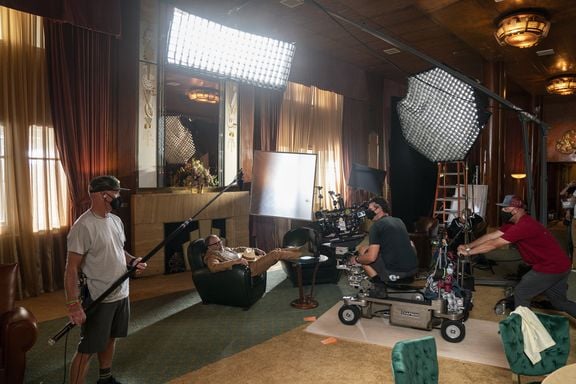
The pilot, which I didn’t shoot, had done the interior shots with practicals. We kept the same ideology and enhanced it. I worked closely with production designer James Philpott and gaffer Dustin Allen to create practicals that had the 1930s Art Deco look, but with LEDs so we had full control with lighting boards. We couldn’t easily add cine lights inside the narrow corridors and suites so we incorporated as much as possible into the set. I tried to keep it close to reality. During the day we would play with light coming through the windows and portholes, but at night we would light more with practicals, or cine lights motivated by practicals.
Did the space impact or determine your camera movement or lack thereof?
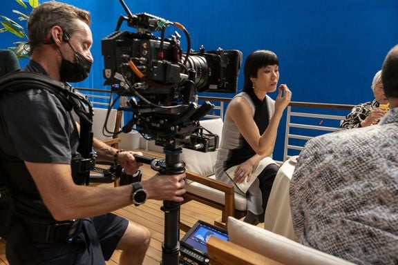
Not really. We used cranes and movement, but didn’t move the camera unless there was a reason to do it. Obviously there’s a lot of walk-and-talks and scenes in the corridors, but every movement would have a purpose to it. When we were working on the deck inside the studio to show the hugeness of the ship we would implement camera moves that would start on the ocean and show the ship and then end up on deck. There were a fair amount of elaborate, big shots with cranes. We tried to hold onto that traditional 1940s look with movement, but obviously using modern tools like Steadicam, dollies with remote heads, and Technocranes.
Which episodes did you shoot?
The story changed after the pilot was picked up so I did those reshoots and then shot episodes 2, 5, 6, 9, and 10, which is the finale. Fernando Reyes-Allendes, AMC shot the other blocks.
What was your framing for the show?
We framed at 2.3:1 spherical to give it a slightly cinematic feel, but it helped in a lot of ways. There’s a lot of tight corridors and long, long sets. Often we would have quite a lot of cast members in frame so that made it easy to place them within the frame. I would also play the characters slightly on the edge or short-side people to give the feel of lack of space on the boat. It was not always conventional framing but still nice composition.
How would you describe the look or visual language of the show? Maybe in a broad sense, but also where there might have been some hard and fast rules.
There were multiple references that I had in my mind but didn’t use them as a straightforward guide. I looked at quite a lot of films from the 1940s, but took things slightly into modern times by shooting on wider angle lenses. For some of the bigger set pieces we would go fairly wide, down to 18 mm, or even beyond with other lenses, and then do the close ups on a 40 mm or 50 mm.
When I’m prepping a job I mostly look to photography as my reference point. Of course I also use films because I need to create the language with the director of what we’re going to communicate, but more often now in my later years I prefer to use the notion of how I remember films rather than looking at it too closely. If you stick to the notion of a memory of a scene there is less chance of reusing the methodology directly and more room for creativity. Similarly, when I’m filming I tend not to watch a lot of films or television because I want to keep an open mind and create things from my own ideas rather than being influenced either directly or indirectly by something I see.
What was your methodology for creating the look of this series?
At the beginning of the project I created the look with directing producer David Petrarca. I took that idea to colorist Russel Lynch at ColorTime, who I’ve worked extensively with on my past TV work in the US. I made a lookbook from still photographs and printed out stills from feature films. We didn’t watch the films together but just used the stills as reference. Then I shot tests with different filters and lighting in Vancouver and he would color time them in LA.
I don’t like to work with LUTs and prefer to create the look in front of the lens like back in my old film days rather than doing it in a computer down the line. I prefer to use colored filters to alter the color sphere of the image in front of the lens because color affects the contrast ratio of the scene and the color of the lights you’re using. I wanted to have a knowledge of what direction we were going with the look beforehand and work with that, rather than shoot it and then figure out how to do the coloring. By the time we started shooting I had 80% of the look dialed in-camera. The dailies colorist would use our reference images and we weren’t very far off.
Being a big fan of creating looks via filters, was there a combination or look you were going for that you built in that way?
The show is set on a ship in the Mediterranean so to achieve the warmth and sun I would warm everything up for the daytime. I tended to use a solid color for that with a combination of yellow filters, which are very subtle but give a distinctive tone, and occasionally with a warming filter. Then I would manipulate the modern design of the lenses by using diffusion to slightly age them and for beauty work. I used several diffusion filters, but I used the Schneider Hollywood Black Magic ones a lot. I also used the Harrison & Harrison diffusion filters and Tiffen Glimmerglass, sometimes in combinations or separately depending on the situation.
I didn’t use them on this project, but I do use the Schneider Radiant filters a lot. They work well with the Leitz lenses because you can barely feel the effect, but it’s there. Same for the H&H filters. It’s just a subtle change of character which I quite like. I tend to go fairly light on the diffusion filters because I would rather subconsciously feel it than see it.
