Only Murders in the Building
2021 | series
DoP Chris Teague I Kyle Wullschleger I Dagmar Weaver-Madsen
Director Jamie Babbit I Cherien Dabis I John Hoffman I Gillian Robespierre I Don Scardino I Chris Teague I Jude Weng I Chris Koch I Adam Shankman I Shari Springer Berman I Robert Pulcini
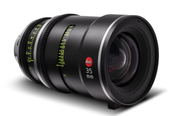
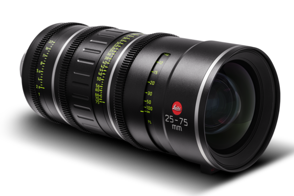
Leitz lens LEITZ PRIME, LEITZ ZOOM
Camera Sony Venice
Production Companies 20th Century Fox Television | Rhode Island Ave. Productions I 20th Television I 40 Share Productions I Another Hoffman Story Productions
Distribution Hulu I Disney+ I ABC
Equipment Supplier TCS
Country USA
Chris Teague, Only Murders in the Building
LEITZ PRIMES AND LEITZ ZOOMS POP OFF THE SCREEN FOR CHRIS TEAGUE IN ONLY MURDERS IN THE BUILDING
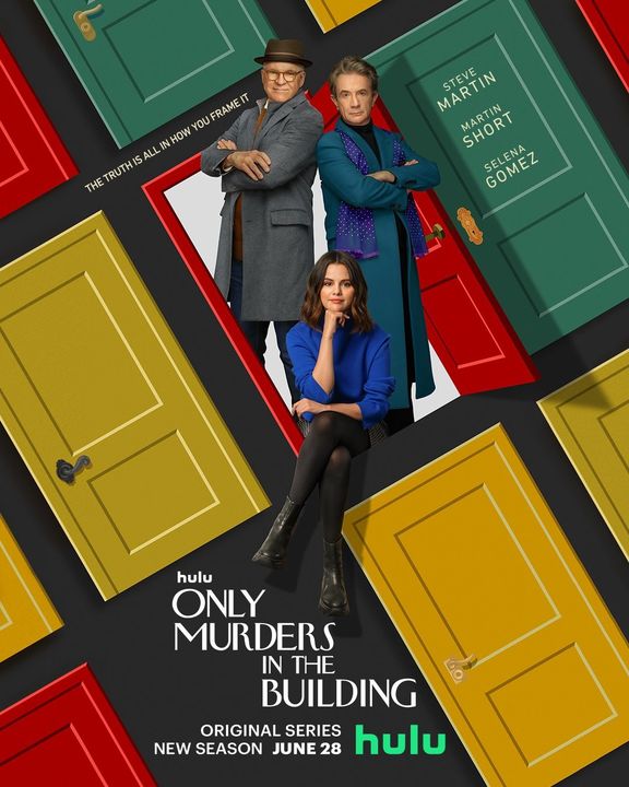
Only Murders in the Building is a 10 episode, half-hour series for Hulu that blends murder mystery and comedy as three strangers with a passion for true crime (Steve Martin, Martin Short, and Selena Gomez) unravel clues about their neighbors in a race to solve a real-life murder in their Upper West Side New York apartment building. Cinematographer Chris Teague shot all ten episodes of this original series created by Steve Martin and John Hoffman.
By Chris Teague
Leitz Primes and Leitz Zooms
When it came time to think about lenses for the Hulu series Only Murders in the Building I thought back to my experience using the Leitz SUMMILUX-C lenses on the Netflix series Russian Doll. I loved to shoot wide open with them because the characters would jump off the screen with an almost three dimensional quality. Since then I’ve shot a lot of projects on the Sony VENICE in full frame and knew I would need lenses to match. The LEITZ PRIMEs had the look I wanted to make this project pop, and when Erik Schietinger at NY-based rental house TCS told me that the LEITZ ZOOMs would also be available to pair with the Primes I knew I’d have a complete set of glass to work with. Working quickly was going to be essential on this production and if we could spend most of our time on the Zooms then we could avoid downtime with lens changes.
The LEITZ ZOOMs are T2.8 and I knew we could still get a very nice fall off at that stop with the VENICE at 6K full frame. When using lightweight zooms on previous Super 35 projects I always miss some of the focus fall off at medium and wider focal lengths, but with the 25 - 75 mm and 55 - 125 mm LEITZ ZOOMs at full frame I could still get a nice shallow look even at 2.8. Apart from the full frame format, I like working with the Sony VENICE because I think the skin tones rendition is very strong and I love the way it handles highlights. These lenses and that camera work very well together.
Influences
Early in development showrunner John Hoffman and executive producer/director Jamie Babbitt clued into film noir and Alfred Hitchcock’s early color films as something to nod to. Rear Window in particular has a lot of thematic similarity with this show: people watching each other, peeking into other people's lives, and thinking they see something that may or may not be there.
From a cinematography perspective, the low angles and wide angle photography in Orson Welles films like Touch of Evil excited us, while the classic color palette of Hitchock films like Rear Window were also a strong influence. We knew we wanted to work in that world and use some of those elements, but without it being too extreme or feeling like mimicry. One of the ways those references impacted our approach was deciding early on that all the sets would have hard ceilings so we could get those low angle and wide shots.
We did a lot of work with production designer Curt Beech and his team to be really insync with practical lighting fixtures, where they were placed, and the wall colors and how they would affect the shaping of light. We are very lucky to have such small, lightweight LED lighting sources that can easily and quickly be rigged in tight spaces with a wide range of color available at the touch of a button. They offer so much freedom to work on a stage where there is no grid to drop a light down from.
The Look
Obviously these lenses are brand new, but they don’t feel modern in any way that feels too crisp or harsh or pinpoint sharp like other new lenses from the last few years. It’s the rolloff around the characters’ faces that gives them a rounded, attractive quality and makes the actors look great. There’s a kind of “hero” moment where we push in on Steve Martin in episode 2, and I remember standing there watching it on the monitor and thinking, “Wow, this lens looks incredible!” You know it when you see it and in that moment I was seeing something on the monitor that looked truly cinematic. It had a larger than life, epic quality.
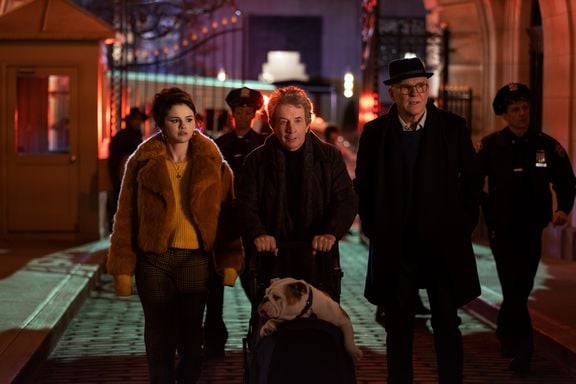
We shot about 60% of the series on the LEITZ ZOOM lenses, but I did love to go to the LEITZ PRIMEs when we had time and would do a 2-shot or wides. My favorite was a head-to-toe type of shot where the character would pop out of the frame because of their great focus falloff. Often in television work you tend toward the telephoto for close ups. We would often go between 50 mm and 75 mm for close ups, but I loved the look of a medium-close single on a 40 mm and we would go for that when possible and appropriate for the story.
One notable exception was a later episode where we had a character who was deaf and we created an entirely different language for how he sees the world. For his moments of keen observation we were on long lenses seeing the world through his eyes and then we would use wide lenses close on his face for his reactions. The wide lenses in the LEITZ PRIME series are fantastic. I went with the 25 mm the most, sometimes the 21mm, and it looked spectacular. The huge field of view felt special and right for that character, but it only worked because it didn’t distort the image. I don’t want the wide focal length of the lens to be the first thing the viewer thinks about when they cut to that shot.
Lighting Less
We worked with a variety of LED sources including LiteGear LiteMats, ARRI SkyPanels, Astera Helios and Titan Tubes, and the Creamsource Vortex8, which is relatively lightweight with a lot of output. I’m excited for more LED fresnels or spot units. We did use some classic fresnels so we could sneak in some hard light to create hard edges, shadows on the wall, and backlight.
Earlier in this era of digital cinematography I used to be more anxious about highlights blowing out and worked harder to control them. But now I feel that in some situations a little bit of blowout is not a bad thing. My thinking changed when I came in to do three episodes of the miniseries Mrs. America. Cinematographer Jessica Lee Gagne had set the look. She has a great eye and on that series she was comfortable with letting some highlights go. I got into the look of the show and realized that if you embrace that approach you can work more freely with practicals and natural light.
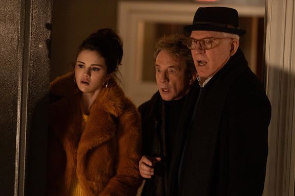
In some situations I’ll dim up lamps so the lampshade is nearly clipping and thanks to the dynamic range of the Sony Venice if it feels distracting in the grade I can tone down the brightness of the shade but still utilize the light it throws. The camera and recording codec offer a lot of wiggle room to bring highlights down. On a show like this one where I’m shooting every episode there isn’t a lot of prep time to address the lighting design of new sets for each episode. The gaffer, production designer, set decorator, and I work together to make sure all the bases are covered and there’s more than we need on the day, especially when you have new directors coming in with new ideas and you need to be able to pivot quickly.
We rated the Venice at 2500 base ISO and shot at 2500 for both the lighting advantages and the look. I don’t love a super clean image so I felt that the negligible noise at 2500 wouldn’t be an issue. Plus, we will typically add a subtle layer of film grain in the grade. The high ISO allowed us to wear an internal ND .6 on the set and easily stop down for focus when needed. I prefer the internal NDs because they can be changed instantly. Pulling a mattebox filter may only take 30 seconds, but in that 30 seconds someone is going to jump into the set, and then 30 seconds becomes 2 minutes or 5 minutes and the creative flow can be disrupted.
Only Murders in the Building premieres on Hulu on August 31, 2021.
Interview by Seth Emmons
