FINDING A DISCIPLINED RESTRAINT WITH LACHLAN MILNE ON EXHIBITING FORGIVENESS
Exhibiting Forgiveness (2024)
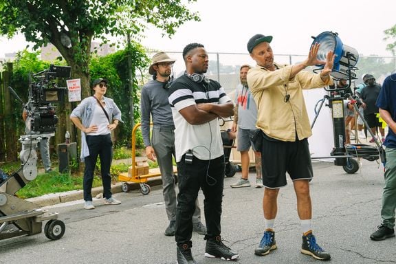
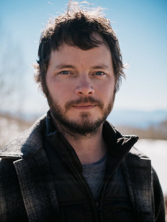
Painter and sculptor Titus Kaphar’s debut feature film Exhibiting Forgiveness premiered on January 20, 2024 at the Sundance Film Festival. Written and directed by Kaphar, the film explores generational healing and the power of forgiveness through the eyes of a black artist on his journey toward success when an unexpected visit from his father upends the life he is crafting for himself. Kaphar partnered with cinematographer Lachlan Milne, ASC, ACS, NZCS to bring this unique story to the big screen.
Seth Emmons: How did you first get connected with Titus Kaphar and this project?
Lachlan Milne: I was at home in Sydney last year [2022] and got an email out of the blue with the script for Exhibiting Forgiveness. What immediately grabbed me about the project was it was a world I really knew nothing about. I’ve done a couple other films in that past for the same reason, like The Inspection and Minari. These were worlds I didn’t know, which I always find really interesting because I learn a lot on those kinds of projects.
It all seemed to happen very quickly. I spoke with Titus after reading the script and we immediately hit it off. He was actually a fan of Minari and wanted to bring some of the sensibilities of that film to this project, if possible. The conversation was very natural and comfortable, and we laughed a lot, so it was easy for me to say “yes.”
What is the story of the film?
The script is loosely based around the childhood of contemporary artist Titus Kaphar, who also wrote the script and directed the film. The main character, Tarrell, grew up in the mid ‘80s; life was hard. His dad was still relatively young himself but had to work and make his way to provide for his family. Unfortunately, he fell into some bad luck and bad habits. The film tells the main character’s journey into finding art and painting as a means of expression and how it can turn a negative into a positive. It’s a fantastic and inspiring story of success on a personal and professional level, and how much family has a role to play in everything.
What were those early conversations about the project like?
In the beginning we spoke about a lot of things other than the movie. I wasn’t familiar with his art until this project came around, but as I looked through it, I found that the storytelling in his paintings is incredibly interesting and there’s no one else doing it the way he does. I’m now a huge fan.
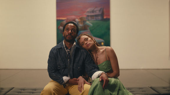
When we got around to the film, one of the things he and I both agreed on was keeping it primarily a single camera film with minimal coverage. We liked the idea of playing it as an ensemble piece as much as possible too. The script included a lot of dialogue, especially for interior locations. You don’t always have to sit and watch people saying words. We started talking about finding opportunities to use the camera to show other things rather than just a close-up of a face while they’re giving you information. It was an opportunity to use the camera as a heightened storytelling device on occasion if the story warrants that.
We also had this concept of “earning a close-up.” When you go tight on something, when you make something big in frame, particularly when you’re shooting for cinema, it’s like saying, “This is a moment that I need the audience to register significantly.” I think if you just do that for the sake of it, it can cheapen it to a certain degree and the pay-off isn’t quite as significant when you really want it to land. We both thought that being disciplined about that was super important.
Were there any references that you used as far as film, art or any other mediums?
One thing we discussed at length was aspect ratio, and it took me a little while to work out why we were having those conversations. Normally it would be very straightforward, but when you look at Titus’s artwork most of it is vertical rather than horizontal. When he frames subjects, when he paints, he’s thinking the opposite of the way we do when we make movies.
Initially I suggested shooting spherical 2:39:1 because I love it, particularly how it frees up the ceiling to do a bit of lighting plus it allows for more actors in frame without too much head room. I cropped a bunch of photographs to different aspect ratios to show him some options. He was the one that made me aware that he hasn’t thought horizontally in the past. He always thinks vertically and wanted to know how we could incorporate that into the filmmaking. It was such an interesting conversation to have. In the end we settled on a 2:1 ratio, but it was a departure for him and got him thinking about how he would “paint” a frame in a completely different way for him.

How did you end up bringing that into the film?
We wanted to shoot as wide as possible, which would obviously bring in a more rectangular aspect ratio, so we did it with blocking and with production design as well. We would often bring the ceiling and floors into the frame, lots of surfaces like that. Titus is obviously a very visual person so we had a lot of conversations about details of the ceilings, colors of the floors, materials on the floors, that sort of stuff. Olivia Peebles, our production designer, found some fantastic locations for us.
Can you talk about your camera and lens choices for this film? How did you arrive at those decisions?
I decided on the camera before we started officially testing at Panavision New York, but I wasn’t sure about the lenses. I wanted to shoot on the ARRI Alexa 35 because I’d used it on a few commercials in anticipation of a film and really loved it. It performs much better in the shadows and has a greater highlight range than my previous favorite camera, the [ARRI] Alexa Mini, which I’ve done a bunch of movies with. I also wanted a Super 35 mm sensor so I had more lens options.
What I was looking for overall from the camera package was something that was small, including the lens and mattebox configuration. I didn’t want too many accessories and all that because we were doing a lot of interior work in locations that were very small and I wanted to be able to shoot as wide as possible. It was all about streamlining, keeping things simple, as small as possible.
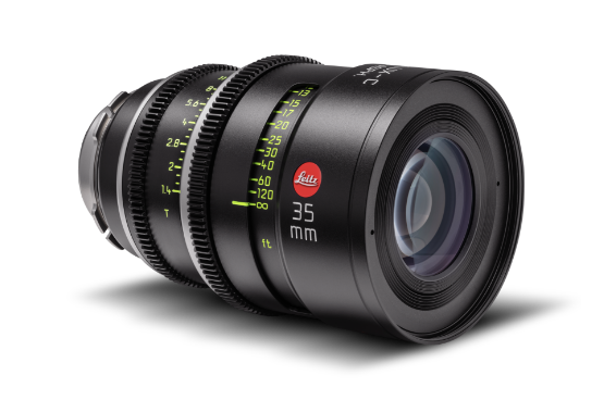
I wanted to get a modern lens for this particular project so I could control things like flaring. It was an almost exclusively black cast, and one of the main reasons I chose the Leitz SUMMILUX-C lenses was that there were a lot of interior day locations with very bright windows. I wanted to be able to hold the latitude and not limit the actors from moving around the location by having to deal with huge amounts of flare, veiling flare, etc. I knew I could add those elements in with diffusion filtration or atmosphere and dial in how much we did or didn’t want for a scene, rather than having a set of older lenses that I would be constantly fighting against.
With some older lenses when you shoot in a wider aspect ratio you have to put people in the middle of the frame because that’s where it resolves. I find that a little tricky sometimes. There are definitely projects for it and I’m sure I’ll use them again, but I think particularly with our film it was a nonstarter for me. I wanted the actors to be able to use the whole frame and not necessarily have to pan the camera. I do appreciate the concept that lenses have become film stocks and that’s where a lot of the creative choices are being made now, but I do like being able to use the whole width of the frame from time to time, rather than having something that breaks down too much at the edge of the lens.
I also wanted to get a lens set that had a lot of options between 18 mm and 50 mm because I felt like that’s where most of the film was going to sit. One of the great things about the SUMMILUXES is they have seven lenses within that range, plus my favorite focal length of all time, the 29mm, which is just such a wonderful field of view.
Because I knew I was going to do wider stuff, I wanted to get a lens set that had very, very minimal breathing because one thing that throws me a lot is when I feel like I’m “aware of the lens”, especially if you’re doing a static shot, like something a bit wider and you see the lens breathe as somebody walks closer or further away. I find that a bit distracting when you don’t have camera movement to hide it. That was the collective checklist I had going into this project and, to be honest with you, the SUMMILUXES ticked all of those boxes. In fact, I literally rolled my same package over into an EA24 video game commercial right after the film

What diffusion were you using on Exhibiting Forgiveness?
I’ve got a bunch of things. I’ve got a set of [Tiffen] Glimmerglass and [Schneider] Hollywood Black Magic, but my default go-to package and the one I use nine times out of ten is a set of [Schneider] DigiCons, which I absolutely love. I run a ¼ DigiCon almost like a “base look”, so I’ve got a couple of sets. It was only when there would be a heavily backlit scene where I felt like it was just getting too milky or washed out that I’d either reduce the intensity of that or take it out entirely. If there was a VFX shot we sometimes wouldn’t use them if we felt like we could do a version of it later on. I like being able to control all of that rather than being locked into something.
What were some of the visual language or aesthetic choices for this film?
One thing Titus really loved about my previous film Minari was that photographically it wasn’t particularly showy. We sat wider and didn’t do much coverage, which I hope showcased the wonderful performances. There were a few nerves on Minari because coverage was so minimal, but it’s a creative choice to not shoot things. I’m a big believer in, “If you don’t shoot it, you can’t use it.” I like to commit to an idea. Generally, I prefer films that are less cutty. Obviously, action sequences and that sort of stuff are a different ball game, but if it's dialog, if the tone of the piece feels right, then I think it helps by not overcovering things. Being very disciplined with coverage was one thing Titus and I talked about very early on.
Erring on the wider side was another initial choice. I’m a big fan of using practical lighting or lighting from outside windows if you’re in an interior location, because then you don’t limit where the actors can or can’t go quite as much. I knew there would be a certain element of improvisation from the actors and we wanted to free them up as much as possible.
We also talked about camera movement. Sometimes people go handheld because what's happening in the scene isn't exciting enough, but then it can feel like the camera is trying to inject an energy that might not be there or shouldn’t be there in the first place. Or, if there's an action sequence the default choice is to go handheld. We were really interested in trying to do the opposite of that. If it doesn’t feel like the camera should move, then don’t move it. It's definitely more a dolly-and-track kind of a film; a lot of static shots, a lot of slow track ins, slow track outs, but always with an intention. We did, however, eventually gravitate towards some handheld for very specific scenes, primarily so I could react to what the actors were doing and let them dictate things a little.
One example of where we used deliberate camera movement was a wide shot of a lady sitting inside a laundromat. A man comes into frame left with the camera just sitting over his shoulder. As he starts to walk towards her, he drags the camera in with him. It enabled us to do a wide shot and then come into a mid shot without cutting . We would do stuff like that quite a bit, which I really like. Camera movement always had a reason. It also helps control the editorial pacing of the scene.
You said you chose this project because it had elements that you didn’t know about and was an opportunity for learning. Can you speak more to that?
I’m a white male from Adelaide, South Australia and experienced a very, very different upbringing and environment compared to Titus’s childhood in a predominantly black neighborhood in Kalamazoo, Michigan. He and I are of similar age, but his experiences are vastly different from mine. One thing I believe, and try to instill in my kids, is that having a well-rounded life experience and trying to understand how other people live differently can make you a more empathetic person. I also find that going into projects where I don’t know very much about the world can lead to some very creative results. It teaches me to be better at my job, but it also teaches me to be a better person.

Overview
DoP Lachlan Milne

Exhibiting Forgiveness
2024 | movie
DoP Lachlan Milne
Director Titus Kaphar
Leitz lens SUMMILUX-C
Camera ARRI Alexa 35
Production Companies Homegrown Pictures | Shade Pictures | Hunting Lane Films | Exhibiting Forgiveness
Distribution UTA Independent Film Group
Awards 2 wins & 2 nominations
Equipment Supplier Panavision | New York
Country USA
Lens used
SUMMILUX-C
Performance
Fast, compact, reliable, beautiful in color and excellent in contrast.


